WingBorne · Custom Typeface + Font Tool
A typeface drawn from wings, and the custom tool built to carry it into a working font.
A hand-drawn display font inspired by fairy, moth, butterfly, and angel wings, developed alongside a custom Next.js system for shaping 94 delicate glyphs into a real, working typeface.
The typeface is still being refined for spacing, consistency, final naming, and future personal and commercial licensing.
Where the wings began
Every wing holds its own language of lines, repetition, softness, and movement.
WingBorne began with the patterns I kept noticing across fairy, moth, butterfly, and angel wings. Some curve like delicate script. Some carry perfectly imperfect repetitions. Others seem almost translucent, as though their details only become visible when the light reaches them correctly.
I wanted to pour that intricacy into an alphabet. The letters needed to feel hand-drawn and ethereal, with enough structure to remain readable and enough imagination to make each capital feel like a tiny illustrated object of its own.
What began as a typeface eventually opened into something much larger. The process of bringing the letters into a working font revealed the need for a tool shaped around that workflow, so I built that too.
Drawing the capital alphabet
Each capital began as a wing before the letter slowly revealed itself inside it.
I began in Procreate with the capital A. I drew a delicate wing, studied the spaces between its lines, and gradually moved its shape toward the structure of the letter. Once that first relationship felt whole, I carried the same wing language through the remaining capitals from A to Z.
Curves became stems. Feathered edges became crossbars and terminals. Small swirls widened into bowls, flourishes, and the places where one stroke needed to meet another. Using the same visual ancestry helped the letters feel related, even as every glyph found its own silhouette.
The process felt somewhere between lettering and illustration. I was drawing an alphabet, though each capital still carried the feeling of a small winged jewel.
The softer letters
The lowercase alphabet carried the same softness through a more continuous rhythm.
I shaped the lowercase letters as a delicate handwritten companion to the capitals, using loops, narrow turns, extended strokes, and small flourishes that could move gracefully from one character into the next.
Numbers, punctuation, and special characters followed. By the time the drawing stage was complete, WingBorne held 94 individual characters across two template pages, including the full alphabet, numerals, punctuation, brackets, mathematical symbols, and the marks required for practical everyday typing.
Completing those smaller characters mattered deeply. WingBorne needed to become something that could eventually live inside websites, titles, invitations, brand worlds, and all the unexpected places a font begins to travel once it leaves the page where it was first drawn.
Capitals, lowercase letters, numerals, punctuation, and special glyphs were drawn individually.
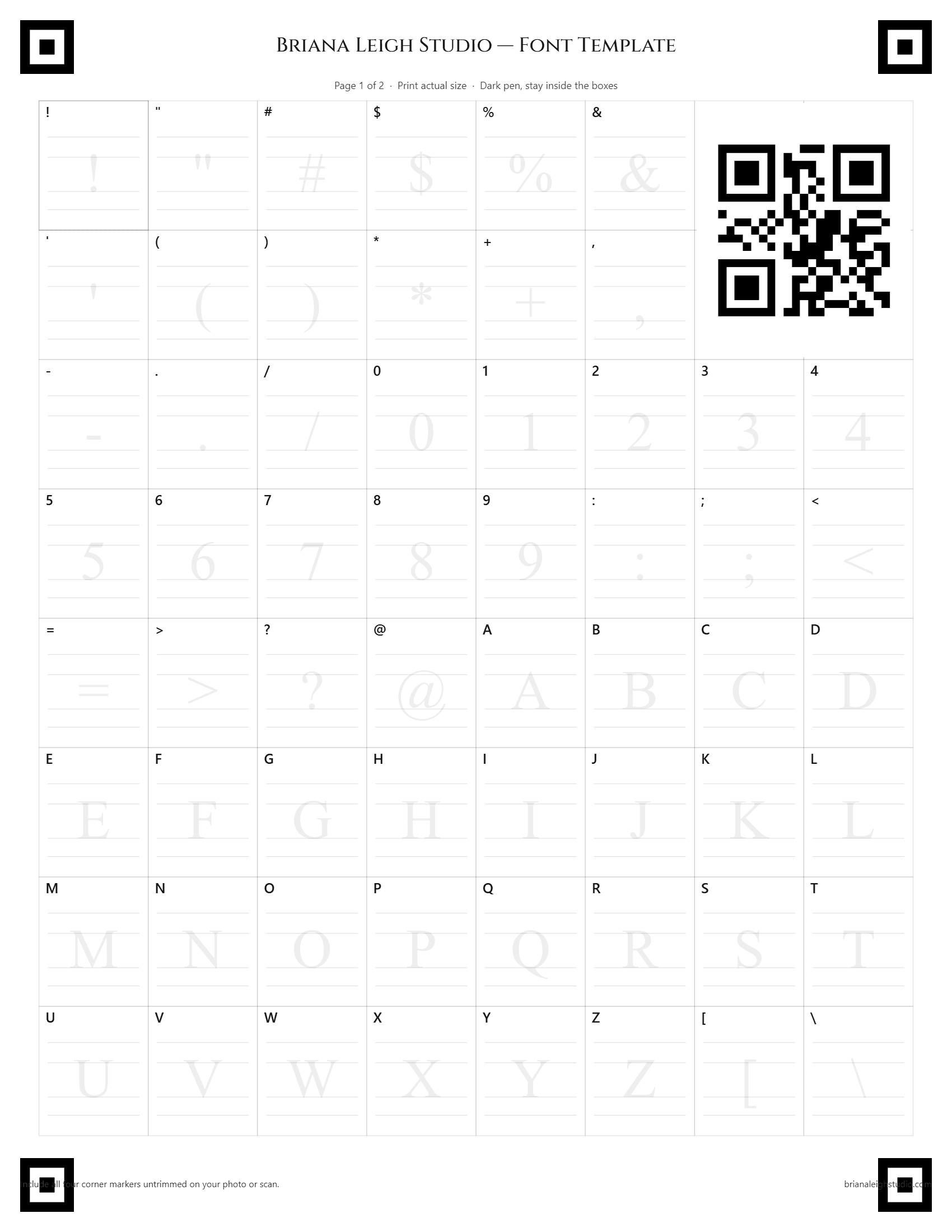
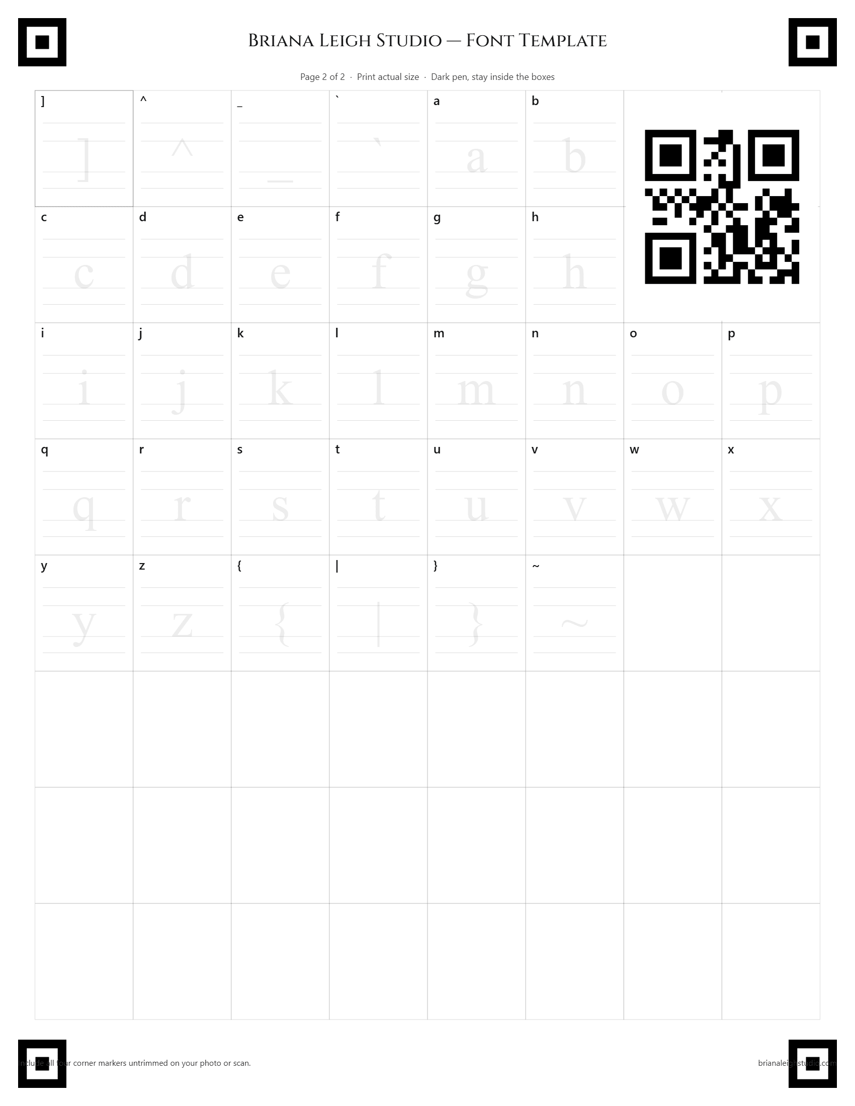
The complete character set is arranged across two templates created specifically for this font workflow.
The tool manages font folders, glyph imports, individual adjustments, previews, and final builds.
The refined glyph set can be assembled into a TrueType font ready to install and use.
Testing the atmosphere
The letters changed beneath every new color, like wings turning slowly through different light.
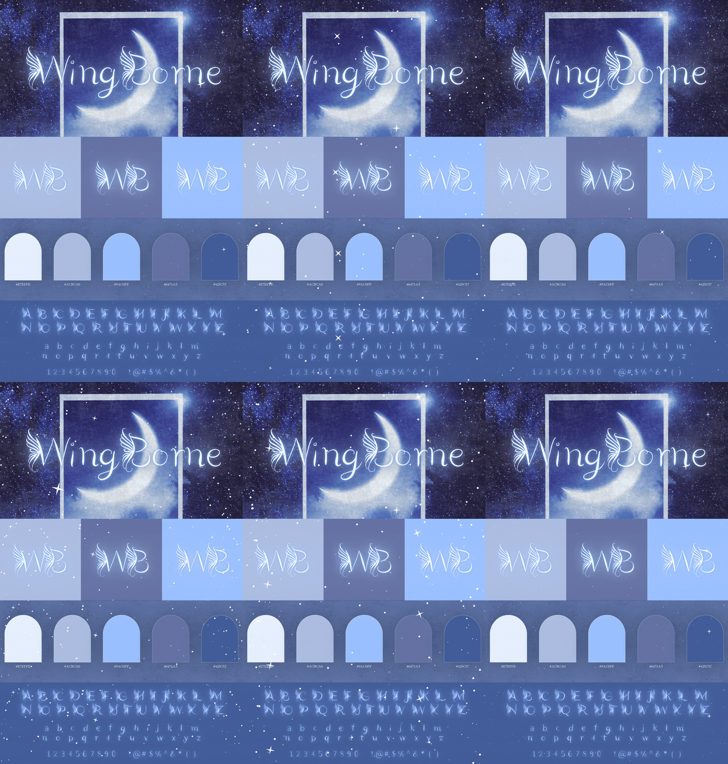
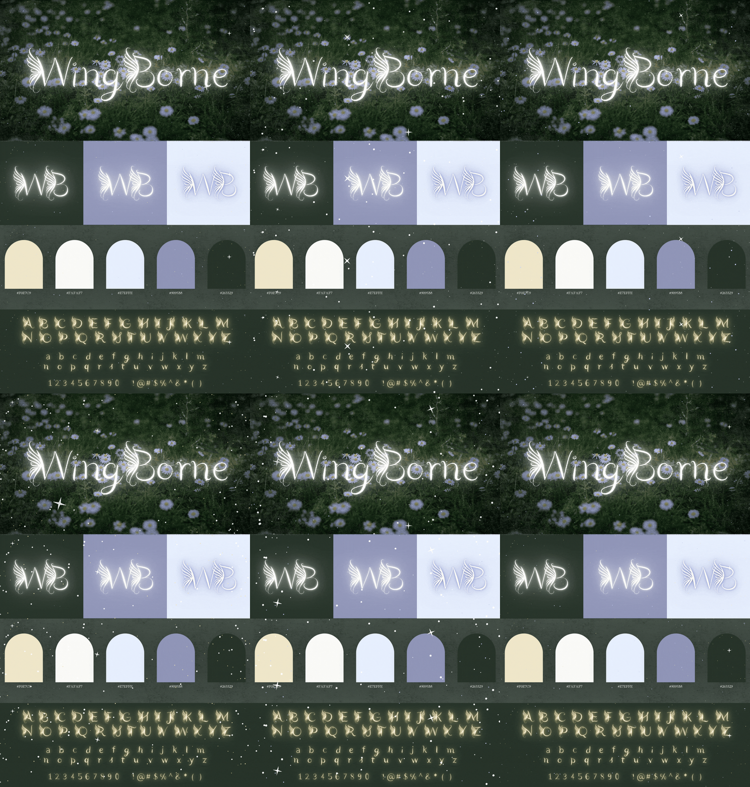
I placed the early WingBorne typeface into two visual studies to understand the kinds of worlds it wanted to inhabit. One became soft, celestial, and dreamlike. The other grew around woodland greens, violet shadows, and the enchanted quiet of something found beneath the trees.
When the first tool became too small
A character limit closed one path and softly opened a much more imaginative one.
I initially brought the completed lettering into Calligraphr, where the drawings could begin their transformation into a usable font. Once the complete character set exceeded the free-plan limit, I found myself looking at the project differently.
I could have divided the alphabet into smaller builds or removed some of the characters I had already drawn. Instead, I began wondering what a font-creation tool would look like if it were shaped entirely around this hand-drawn process.
That question became a custom application capable of holding all 94 glyphs and giving deeper control over their placement, spacing, scale, and final relationship to one another.
Two pages for a complete alphabet
I created the templates, the character map, and a small visual marker that helps the tool recognize each uploaded page.
The 94-character system is divided across two custom template pages. Each page gives every glyph a defined place while leaving enough room for the softness and ornament of the hand-drawn lettering.
Filled templates can be scanned through the automatic detection flow using the custom marker, or uploaded as two separate pages. The blank templates shown here introduce the structure of that system before the letters are drawn into place.
Inside the custom font tool
I built the font tool I wished I could reach for.
The application was programmed in React with Next.js and uses Firebase and Firestore to remember each project, uploaded page, cropped glyph, and individual adjustment. It was designed around the exact path the typeface needed to take from drawing to finished font.
A home for every font
Each typeface can live inside its own project folder, keeping the uploaded templates, imported characters, individual adjustments, and final build organized as the design continues to grow.
Two ways to bring the glyphs inside
Filled templates can be uploaded through the automatic detection flow, where a custom marker identifies each page, or added individually when a character needs a guided import.
A closer place to refine every letter
The adjustment workspace opens into a scrollable strip of glyphs, allowing the baseline, scale, container width, and horizontal position of each character to be shaped with its neighbors in view.
A complete font workflow
The tool holds projects, characters, adjustments, and previews in one place, then assembles the refined glyph set into a working font file ready to install and use.
Teaching the alphabet to sit together
A collection of lovely letters becomes a font when the spaces between them begin to feel intentional.
The Adjust Baseline & Size workspace opens into a dedicated view with every uploaded glyph arranged inside a horizontally scrollable strip. Each character can be refined while keeping the larger family close enough to compare.
Every glyph can be adjusted through its baseline, scale, container width, and left or right position. A live preview responds as the values change, allowing words and phrases to reveal where the rhythm feels spacious, crowded, uneven, or unexpectedly beautiful.
This stage allows the hand-drawn character of the alphabet to remain visible while giving the typeface the consistency it needs to travel beyond the original drawings.
Study the wings
Fairy, moth, butterfly, and angel wings established the visual language of softness, movement, repetition, and ornament.
Draw the alphabet
Capitals, lowercase letters, numerals, punctuation, and special characters were drawn individually in Procreate.
Build the system
A custom Next.js application gave the complete glyph set a place to be imported, organized, adjusted, and prepared for export.
Refine the rhythm
Every character can be positioned, resized, spaced, previewed, and prepared before the working font is assembled.
The final threshold
At the end of the process, the drawings leave the page and become something that can be typed with.
Once the glyphs have been reviewed, the tool assembles them into a TrueType font and exports the finished TTF. The export itself is beautifully quiet. The more meaningful part is everything the file is carrying with it.
Every wing, loop, adjustment, handwritten line, and small technical decision becomes part of an installable typeface that can move into new compositions long after the original Procreate document has been closed.
Sometimes the tool an idea needs becomes another lovely part of the idea itself.
What the project opened
WingBorne began as an alphabet and grew into a custom creative system for turning hand-drawn letters into a working typeface.
This project brought illustration, typography, interface design, image processing, and font generation into one continuous creative path. Every discipline arrived because the idea before it needed somewhere new to go.
The typeface is still being refined for spacing, proportions, character consistency, and final identity, with a planned release that includes thoughtful personal and commercial licensing.
For now, WingBorne stands as a reminder that even the softest idea can grow into something technically ambitious without losing the delicacy that first made it worth following.